Marc English : Design
Designing Identity
The Present : The Future
What were you doing twenty years ago?
TWENTY YEARS AGO — 1998, I had a book published.
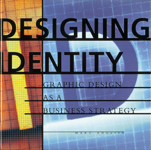
Designing Identity: Graphic Design as a Business Strategy was released.
Here’s the copy I cobbled together for the book jacket flap:
According to the great Paul Rand — among whose creations was the timeless IBM mark — a well-designed logo is a reflection of the business it symbolizes. “If, in the business of communications, ‘image is king,’” he writes, “the essence of this image, the logo, is a jewel in its crown. Here’s what a logo is and does: a logo is a flag, a signature, an escutcheon; a logo doesn’t sell (directly), it identities; a logo is rarely a description of a business; a logo derives its mean- ing from the quality of the thing it symbolizes, no the other way around; a logo is less important than the product it signifies; what it means is more important than what it looks like.” Designing Identity shows how excellent visual identity creation and redesign can help define a company and communicate its goals and aspirations to the marketplace.
I considered myself fortunate to be able to include an essay by the late Paul Rand, after reaching out to his wife.
Twenty-plus years ago — 1997 — I was writing and designing that book. Back in 1995, while living in Lexington, Massachusetts, I’d been asked by Rockport Publishing to write a book about “how to design a logo.” As I’d not only studied that process in college, but was also teaching it, I was adamant one could not learn how to design a logo with a book. Design, identity, branding, require more than a book, they require concentrated study to do it correctly.
But I did tell them I would write a book about the value of identity, as I could easily make a case for that topic. In doing so, I could then write a book which had value beyond that of graphic designers trying to figure out how to design a logo, but also reach out to those interested in branding, marketing, design, who were not graphic designers. Folks in marketing, sales, or entrepreneurs with an eye on the ball. Folks like you. They quibbled with me about my title — Designing Identity: Graphic Design as a Business Strategy, — arguing it sounded “academic.”
“But I am an academic!” I told them. They wanted something that “marketing had tested” and suggested the title be 21 Successful Identities, for as they said, “the number ‘21’ tests well with audiences.” I did not tell them to stick it. Instead I told them that while there were nine industry categories, each with a long case-study, there were close to forty examples overall, that ”21” was out of the question. Not only that, but by their very inclusion, each project was deemed successful, so to flaunt that in the title was superfluous.
Initially hardcover, the book went to paperback, as — just as I’d intended — it sold well beyond the publisher’s original target market of graphic designers, and was even being used in classrooms. Rockport asked me to write a follow-up, but when I did not agree to their financial terms (with no royalties, and having already noted what efforts were involved, knew the fee hardly compensated for my time — at one point I did the math, and realized I was working for $0.72/hr!), they had someone else write the “follow up,” riffing on the same title they’d once doubted.
Twenty years ago there were few, if any, books that offered case studies of any kind. I did my homework, and even the Graphis case-studies were bereft of text (though the over-sized books did look gorgeous). For Rockport, I was the first author/designer on their roster, as most designers only designed the books. Since then, a number of designers have authored books for Rockport. Twenty years later, there are aspects of the book’s design I’d change: simplify the layouts, use a typeface that’s easier to read for the main text, even though I still love Bembo. And I never did love the cover: too convoluted, lack of concept. The model I built when trying to humor the publisher by using a number on it fares better today in its simplicity.
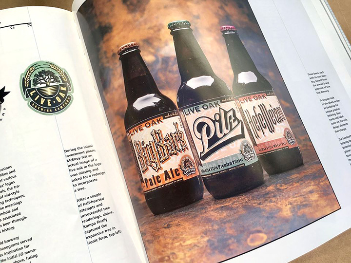
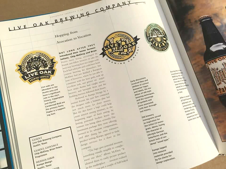
Back in those days not many designers were writing books, and there was no push from the publisher for what’s today considered a de rigueur “book tour.” I did work up a one-off event at a Barnes & Noble, in Austin (I’d not lived in town long enough to realize that Book People was the local place to not only buy books, but for book-signings), that included local designer David Kampa (with whom I then shared a studio) and his client, Chip McElroy of Live Oak Brewing, along with designer Jill Giles, of San Antonio’s Giles Design and her client, clothing designer, Kathleen Sommers, and DJ Stout, then art director of Texas Monthly.
If you ever get a chance to write a book of case studies, always be sure to dance with who brung ya. Not only is Kampa a wonderful human, who welcomed me to Austin and offered me studio space during a particularly hellish time in my life (daughter abducted from Boston, taken just shy of Mexico; a particularly nasty divorce and custody battle — all while trying to work and write this damned book), but he’s an extraordinary designer, who’s work deserves every bit of praise it can get. In the years since, Kampa has gone on from doing the branding for that local brewery, to tackling the branding for the Texas stalwart, Shiner Beer, in his former role as Creative Director at McGarrah/Jesse.
Likewise, Live Oak Brewing made great beer. Or I should say, makes great beer. Twenty years later, Live Oak Brewing has expanded from a tiny micro-brewery to an Austin institution. You should visit their brewery near the airport, next time you fly into town.
If in Austin, you may even find yourself crossing paths with Ed Bailey. When I wrote the book, wanting to include the identity for the Rock & Roll Hall of Fame + Museum, in Cleveland — that I could find an angle to cover my pre-design love, rock’n’roll — Ed was their marketing director. It was not a few years later, when Ed moved to Austin, to find himself equally influential and neck-deep in the Austin City Limits machine. Rock on!
In writing the book, I pointedly stayed away from focusing on the Big Names in the Big Cities, to make clear that there’s good and great design everywhere. Yes, a few big names and cities cropped up, after all, most of the designers I included were often some combination of friends, peers, or those whom I respected.
Twenty years later it’s telling to see who’s still in the game (Michael McPherson, Nancy Skolos, Nancy and Joseph Michael Essex, Sean Adams, Noreen Morioka, Sonia Greteman, Andy Cruz, Sharon Werner, Drew Hodges, Forrest Richardson, Steven Wedeen, Steve Sandstrom, among others), which companies and institutions still thrive (Burton Snowboards, the Mirage Hotel, the Rock & Roll Hall of Fame, RENT — then on Broadway, now in a High School production near you!), and who has passed on (RIP Tom Corey, Rick Vaughn, Margo Chase, Rich Roat).
For myself, the book helped put me on the map, as I was then asked to lecture on the subject, first at the Orange County Chapter of AIGA (thanks Tony Colombini!). It was only a matter of time before I became tired of speaking about the book, as it purposely included none of my own work. I believed it would be too self-serving to include any work of my own, as I’ve always chafed at seeing author’s include their own work within the body of any work they may have otherwise curated. There’s a solid line between being an advocate for an issue (in this case design and branding), and blowing your own horn.
So in a relatively short span, I started combining a talk about the book itself, with a talk about my own process, The Way of the Design Shaman, as the latter was being requested while I was on the road, and I felt no need to hype other’s work, or even a book for which I received no royalties. The Way of the Design Shaman brought me across much of the United States, down to Mexico, and even further, to Guatemala, in both professional and academic settings. I earned a particular reputation for a particular kind of presentation, one that finally married aspects that had been fundamental to earlier facets of my life, including music, performance, and theater.
Twenty years later, you can find a copy of Designing Identity on my favorite used or rare book site, alibris.com for $0.99 plus shipping. Every so often I pick up a few copies, being sure to scoop up the hardcovers when possible, as the softcover does not include the end-papers. The end papers consist of drawings I did when studying at Massachusetts College of Art, with a team of researchers (lead by John Noxon and Deborah Marcus) documenting the overlap of the rock art — pictographs and petroglyphs — of Fremont and Anasazi cultures, in the Four Corners region of the United States (Utah/Colorado/Arizona/New Mexico). The meaning of most of those ancient glyphs, some more than 2,000 years old, are lost in time, as the oral language spoken by the shaman who interpreted those drawings was never further codified, for they had no written language.
Still, some of those ancient marks have stood the test of time, unlike some of the brands in the book, which are very much dated. Yet I’m pleased that many still stand the test of time, and for those that do not, much like those ancient petroglyphs, some have not aged well.
The lead-off project in the book was about Digital. Digital Equipment Corporation had re-branded as DIGITAL by the time the book came out. They later sold out to Compaq, which sold out to Hewlett-Packard, which morphed into HP Inc. Digital did not stand the test of time. That’s the way of the world.
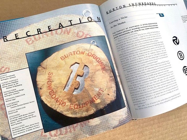
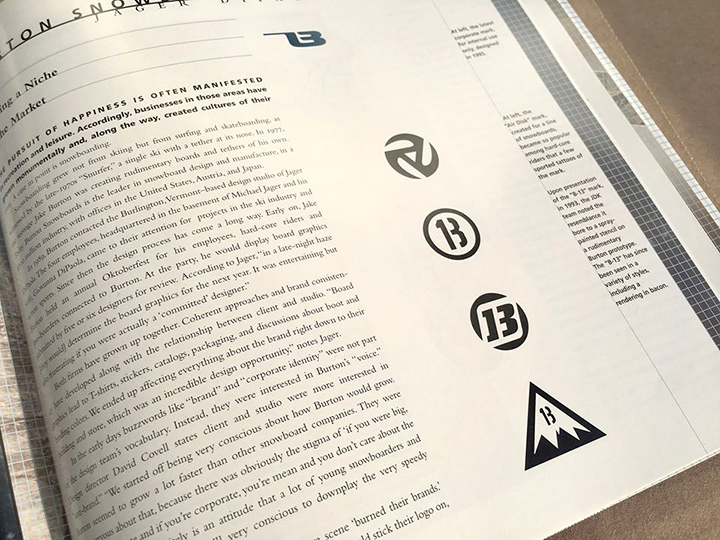
The year the book came out was the first year that snowboarding became an Olympic sport. Consider this: Burton Snowboards, one of the case-studies, put the sport on the map, as they INVENTED the snowboard. By the time the book came out, they’d been around for several years, long enough for others to copy their branding. Yet it was Burton that drove the industry, and that gives pause for thought, when one sees how one brand can push a product that not only becomes an international success, but also creates a new Olympic category.
What stands the test of time? This book? Yes and no. Why no? Businesses change, evolve, as do styles. Way back when, having taken a class with Massimo Vignelli, he signed his monograph for me, extolling the timeless, and warning against trends. Ah, were we all as prescient when it comes to styles and trends.
I’d not read the Tazo Tea story since I wrote it, back in 1996 or ‘97, but it still rings true.
Twenty years later, Tazo branding has seen changes that would warrant a detailed explanation and update. Short version: the original Tazo goal was to be “the Starbucks of teas.” A year after the book was published, in 1999, Tazo was bought out by Starbucks, and branding was tweaked (to say the least), to refine their messaging. A total overhaul to the Tazo brand happened in 2012, after Starbucks did a re-brand of their own. By 1999 all Tazo branding was done in-house at Starbucks, as compared to the originally outsourced design studio. The overhaul — according to Starbucks — was done to counter a market that had caught up with the benchmark Tazo had set 15, 20 years earlier, and there’s a case study of sorts, online. While I buy the gist of it, the article is a bit obsequious.
But what I consider the true story, will be found at the end of this post, as a few years back, I reached out to Steve Sandstrom, of Portland, Oregon, who’s studio — Sandstrom Design — did the original branding, which I then considered quite brilliant. I still do. And as I suspected, his intent was even greater than what Starbucks proposed.
Want to see the great stuff Sandstrom did, back in the day?
Want to read the BrandNew take on ANOTHER rebrand, long after Sandstrom resigned the account? “Not bad,” is their final word, a bit underwhelming, considering Bryony Gomez-Palacio and Armin Vit very much know how to whelm when writing.
Read Steve’s own words, which follow, on the Tazo branding process:
01.04.2017
Hi Marc,
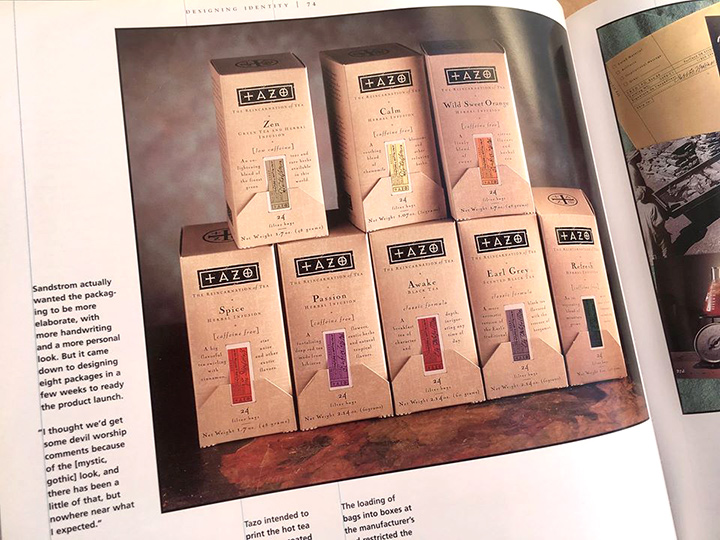
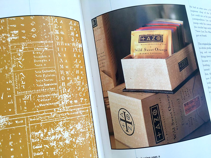
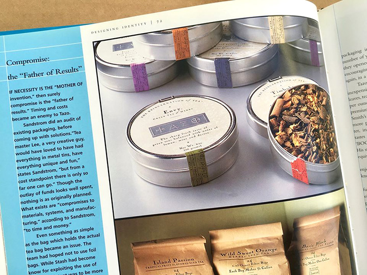
It’s a long and complex story, but the only package in your collection that I did was the first carton on the top [ed. I’d sent Steve a few images, to comment on]. And that was not the original, which is in your book. The original carton had a front flap at the bottom, covering an opening to dispense the sachet envelopes. The flap was held closed by a small sticker which is represented by the printed orange strip in the version you have. Each flavor had a different sticker with colors and information specific to that blend or infusion. These were applied by hand and gave the whole presentation a custom feel.
That was the start of an incredible success and award-winning deluge for a variety of packaging forms and various other branding materials — an amazing collaboration with Steve Smith (tea master) and Steve Sandoz, (writer and creative partner). We started before there was a name or even a product line and essentially went from scratch.
Starbucks purchased the brand 4 years in, and began a multi-year course for dumbing the brand down for reasons they believed to be more mass appealing, and they made arrangements with Kraft Foods to distribute Tazo to their grocery retail network.
After 11 years I resigned the account. I disagreed with the Starbucks direction. The new managers were from P&G and T-Mobile and wanted to be more like Mighty Leaf and others in the category (brands that were created because they were inspired by Tazo). My position was that without distinction and without a forward-looking/striving position in the market, there would actually be no mass appeal. The appeal could only be average. Fine for a commodity, maybe, but we didn’t have a commodity brand and I wasn’t interested in undoing what we’d worked too hard to achieve.
Change can be great, especially with a clear direction and understanding of potential. Time brings shifts in values or interests with newer, younger, expanding consumers, etc. It’s difficult to create an iconic brand. It requires something that can stand up to time, which also means it can’t be of any one time specifically. And it requires a commitment from the various brand managers and marketing people involved over many years. This is an unlikely thing in itself.
Starbucks goal after buying Tazo was to increase sales from $30M to $500M. This freaked out the management. While the next three years of research was being done to justify a change in brand direction, Tazo grew to $350M just with the increase in distribution and a change to the carton style you have (they wanted to increase margins by saving costs of the stickers and application, even though it was already cheaper because it was being machine applied). So a new goal was adjusted to $1 billion.
If Starbucks knew what the Tazo brand was potentially worth, they should have reset the goal to several billion, and created a lifestyle brand that went beyond tea. Tazo was an attitude and a multi-cultural path to more opportunities. It was design brand as much as it was a tea brand. If you think about the last time you bought a pot at Pottery Barn, you’ll understand that as a concept Tazo was less limited than even Starbucks to become something well beyond just tea. But a vision didn’t exist.
Today, I think of Tazo as a product line, not a brand. It looks like so many other brands when it looked like no other at the start. Starbucks has purchased Teavana because Howard Schultz thought he was buying a high-end, high-quality tea brand. When in fact, it was crap. The chai he collaborated with Oprah [on] from Teavana was actually Tazo chai, because Teavana chai was awful. He probably never understood what he had with Tazo, or he realized too late, but I suspect the former. Tazo lingers on at grocery with no one left from the original Tazo team.
If you want some great tea – arguably the best in the world – look for Steven Smith Teamaker. It’s the tea we’d have created if Tazo hadn’t gone mainstream. We avoided the Tazo-inspired and sameness the category had become. That’s also a reason to change. When every brand looks the same. If you could create a cliché design for tea, then you know there’s opportunity to do something different. But timeless? Still a challenge.
Steve
