Marc English : Design
05 HULU
BRANDING : TYPE DESIGN : TITLES : ANIMATED GRAPHICS : POSTER
I run into director Rick — sorry, I keep forgetting, RICHARD — Linklater at the Fire Relief benefit concert (yes, we did the branding) for the victims of the historical fires a month earlier that wiped out swaths of Bastrop and central Texas. Rick mentions he’d like to talk to me about a project he’s got cooking. We sit down a month or so later, to share his ideas and a script by Speed Levitch.
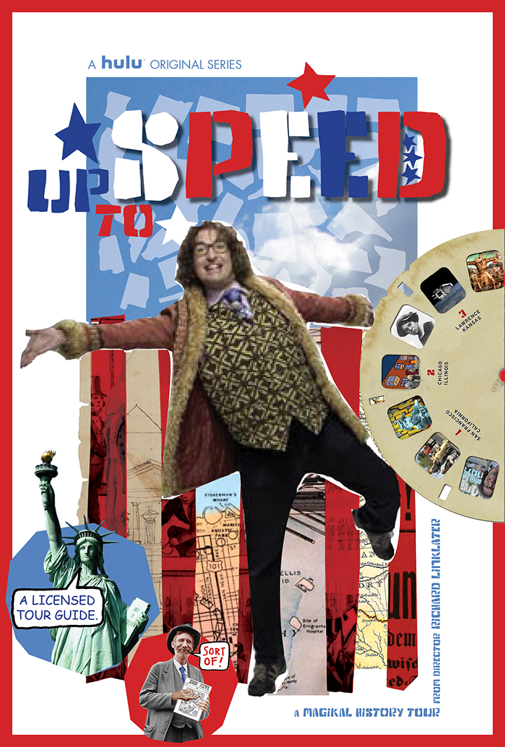
He’s putting together a team, a dirty half-dozen, and he wants me to be the explosives specialist. No, that’s not quite it, but close. He’s been contacted by Hulu. They want the cachet of his name, as well as the canniness of his content, on their platform. He can do whatever he wants. He doesn’t opt for a film, but instead a series. A magikal history tour series, hosted and written by the always engaging, always brilliant Timothy “Speed” Levitch.
He’s worked with Speed before on other projects (Waking Life, School of Rock). Speed is a renown tour guide, and the documentary by Bennett Miller, “The Cruise,” has gained a legendary following. Miller went on to direct Capote, and Moneyball, and The Cruise offers up Speed’s insights and philosophies, juxtaposed with his unequaled skills as a tour guide in New York City.
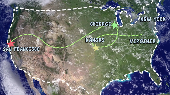
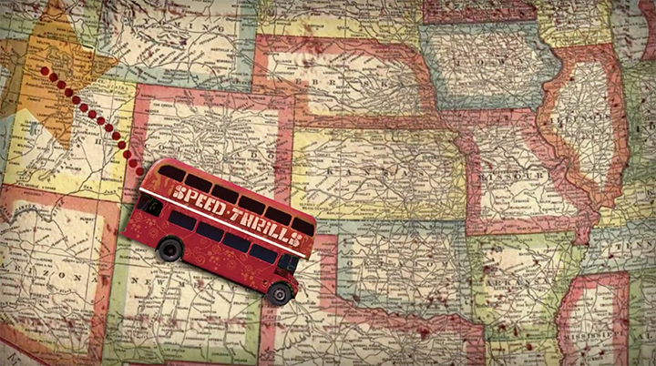
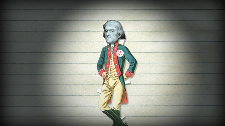
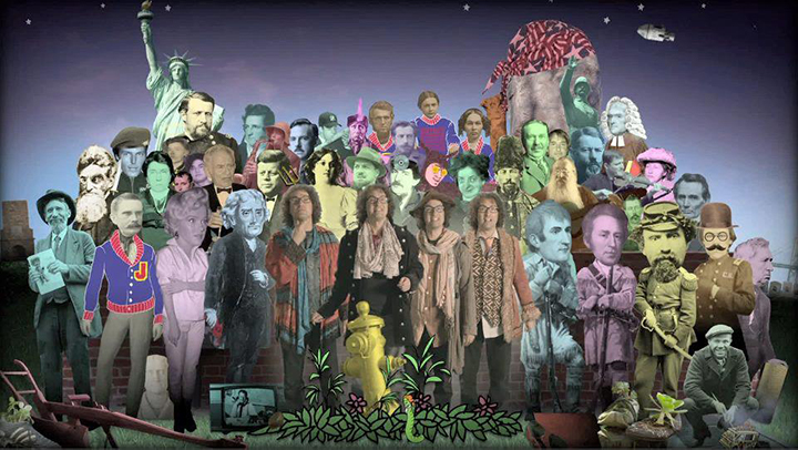
The script becomes the first of a 6-part series for Hulu. “Up To Speed,” a half-hour long, offers Speed’s take on San Francisco, New York City, Chicago, Jefferson’s Monticello, the 1800’s border wars in Kansas, and more, all with his vast knowledge, his witty, funny, profane, urbane, and sometimes, close to insane rambles.
Not quite documentary, the shows delve into each city’s rich history. But this is NOT a ken brown project. It’s 100% linklater. Which means smart, funny, on point.
Rick does NOT want this to be a “Ken Burns” doc, with no slight to Mr. Burns. So I suggest maybe Monty Python’s Flying Circus? It’s a go.
Also on the team, ace editor Mike Saenz (assistant ed. on Boyhood), and composer extraordinaire Graham Reynolds. I bring on board the witty and talented animator Jake Mendez, for his own take on what my own team brings to the table.
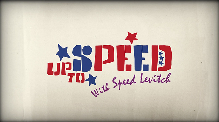
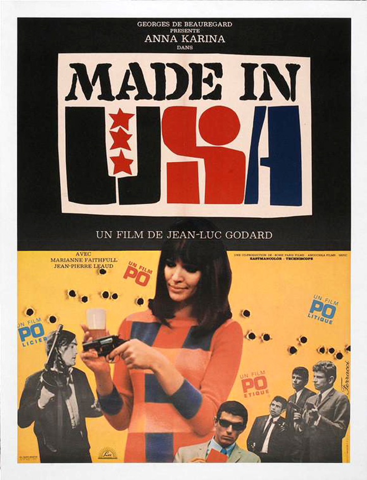
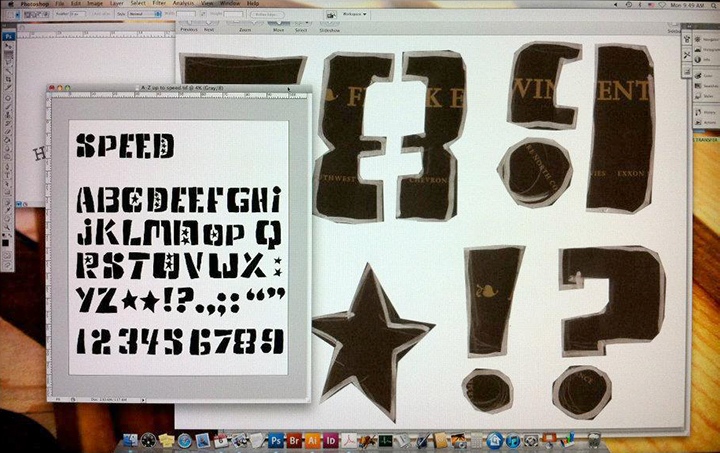
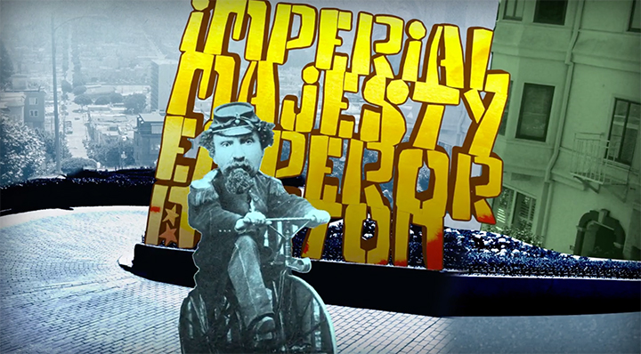
We’re sitting around the table at Detour, Rick’s production office and the subject of a title treatment is raised. What kind of typeface or lettering is “Speed”? He’s an iconoclast, if there ever was one. I look up at the MADE IN THE USA poster for the 1966 Jean-Luc Godard film hanging right in front of us. There’s Godard, another iconoclast, with a film on HIS take on the States. Hmmmm. “Heck,” I say, pointing to the poster, “I could just create an entire typeface around three idiosyncratic forms right there.” That’s how we developed the typeface Speed Up. And yes, we pointedly used the typeface Mistral in the title. Not only that, but we used Comic Sans on the poster. And yes, we pointedly used Comic Sans on the poster. Because if anyone can use Comic Sans without irony or idiocy, and with all sincerity, it’s Speed Levitch.
“I trust Marc to do the right thing and I give him enough room to do so. Marc is great to work with and his ideas are always on target. I find his commitment to a project ensures that every detail is well thought out and executed. As a filmmaker, I recognize the authenticity of Marc’s visual storytelling. I value his input and look forward to working with him again.”