Marc English : Design
08 UNIVERSITY OF TEXAS SCHOOL OF ARCHITECTURE
BRANDING : TYPE DESIGN : INTERIORS : PUBLICATION DESIGN : PACKAGING : WEB
It’s always an honor, a joy, when we get a call from folks that appreciate who we are, what we do, and how we do it. That often leads to our best work. It’s even more exciting for us when the assignment combines what we love most. In this case, Architecture and Academia, the former as close to God as any architect will tell you, and the latter high in the Ivory Tower.
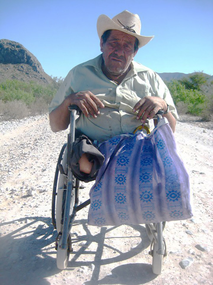
Far from any ivory tower, I was riding in the Chihuahuan desert, taking the long way from the Universidad de Monterey, where I’d been teaching, and heading back to Austin. Dirt and rock roads and riding up a dusty valley on my motorcycle, thinking I was exactly where I was supposed to be — in a god-forsaken part of Mexico, leaving my role as educator, ready to go back to my role as design studio principal, yet currently doing one of the things I love most: exploring off the beaten track. Some good stories go with that trip, one of which was meeting Pancho Muñoz Cortez*, middle-aged, legless, in a wheelchair, hauling himself along a nasty caliche road. He spoke no English, and my Spanish is terrible, but we made ourselves understood. Languages and cultures have always kept me interested.
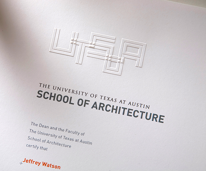
In a day or two I’d be presenting the logo — only one, no more — to the UT School of Architecture committee, with a language and culture of their own, which I’d come to understand. Anyone who knows or works with architects knows they do not take a back seat to graphic designers. Yet they’d all be seated, listening to me while I stood. By the time the presentation was over, there was a scramble, a scrum to get the T-shirts we’d printed with the new logo. The assembled body was like kids at a concert.
“The word on the street is you only presented ONE logo!” came the words of a colleague on social media. But we’d done our homework, understood their competition, both in the U.S. and abroad, and what UTSOA needed to be both appropriate and unique. Later, our UT liaison said “I’ve never seen a studio bring their A-game as well as Marc English Design.” Happy to hear that, and happy to have won the account over our steep competition.
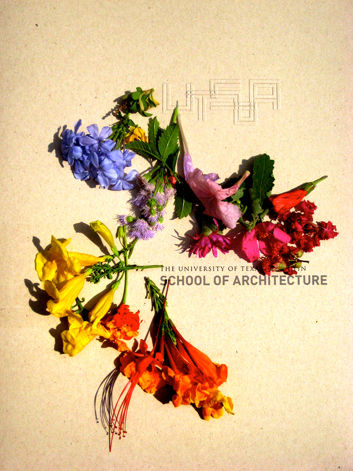
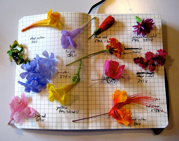
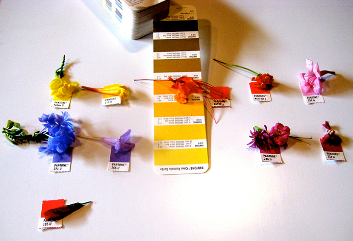
When it came time to develop an extensive color palette, we looked to the local wildflowers for inspiration, to be juxtaposed against the warm and cool greys of the basic palette.
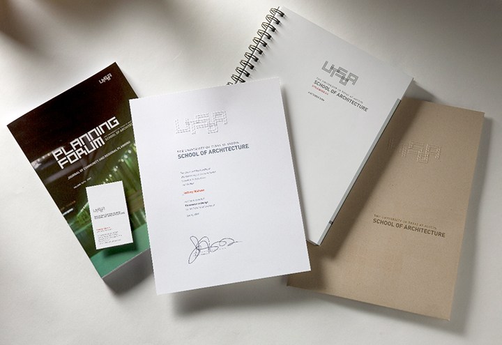
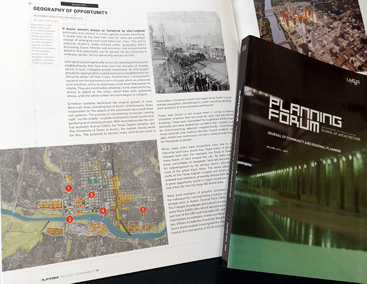
We also developed a custom typeface, based on the geometry of the logo, to be used as mastheads for both their PLATFORM and PLANNING FORUM publications, the former a news magazine, and the latter a collection of white papers.
Pancho Muñoz Cortez, on the road between Espinoza and the vil- lage of Presa de Chaires, in Coahuila, Mexico. Whenever I am feeling a bit down about whatever conditions or circumstances I have to deal with, i think of Sr. Cortez.
Hot, sweaty, covering around 7 miles in his wheelchair for this small bag of groceries. No complaining. No one to care for him. For all I know he’s my age. The weather, the landscape, wears one down.