Marc English : Design
03 CHRONICLE BOOKS
PUBLICATION
The biennial AIGA conference is to be held in my hometown, Boston. Attendees have the opportunity to lunch with a dozen design “luminaries,” and they have condescended to have me as one of them, as I was once a Bostonian, mas o menos.
I was happy to discover a former student of mine, from when I taught at my alma mater, MassArt, Vanessa Dina, at my table. Then, as now, she was an art director at San Francisco’s acclaimed Chronicle Books. I was very happy for her. Every teacher should hope their students surpass them. As a professor, I’ve long seen myself as a bow, doing what I can to launch my arrows, my students. Some go straight and true, and I can see them hit their target. Some have a slight bend to them, and I witness their downward slant to ground. And then there are those who fly so high and far I cannot see first-hand what they’ve done or accomplished. Fortunately, Vanessa shared her experience, to the degree that soon enough, the student was now the client.
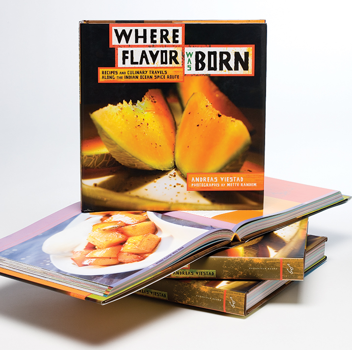
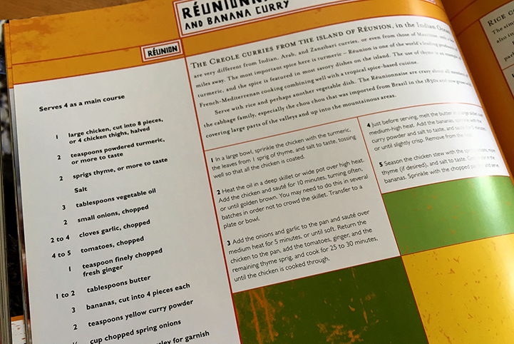
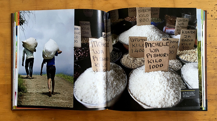
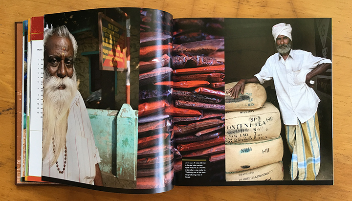
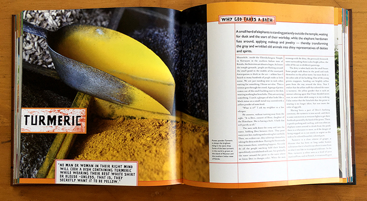
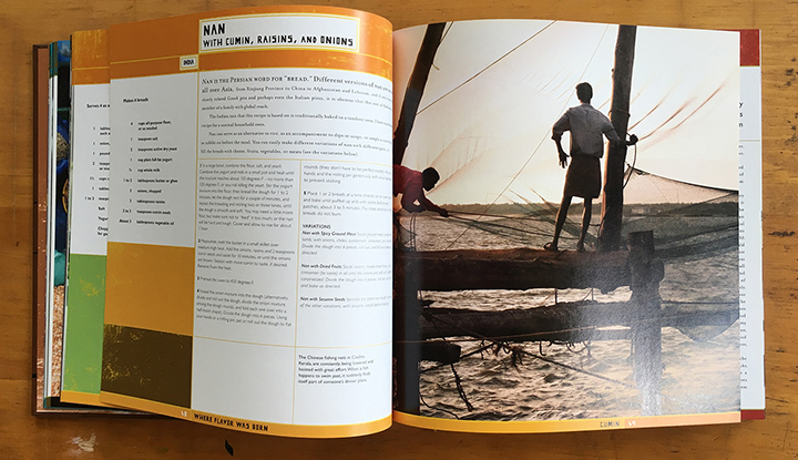
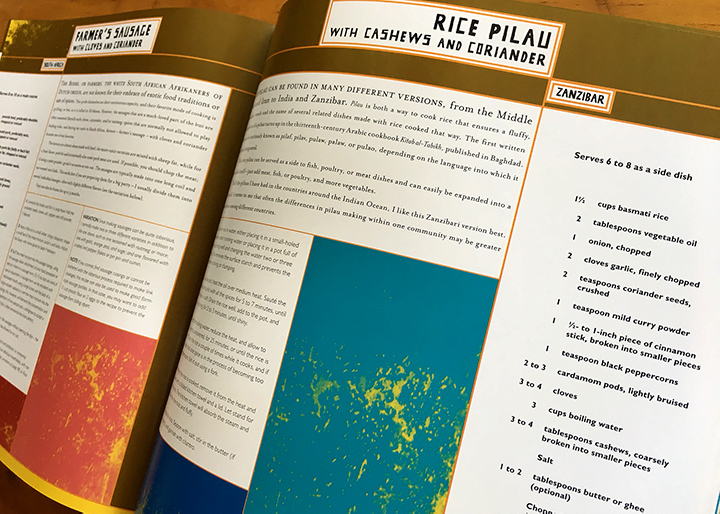
WHERE FLAVOR WAS BORN
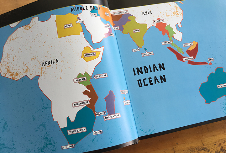
“The cooking of the Indian Ocean has many temperaments but only one soul, and that soul is to be found in it’s spices,” so says chef and author Andreas Viestad, who has homes in Oslo, Norway, and outside Cape Town, South Africa. It was our responsibility to find that soul and put it on paper. Of course it was easy to draw an inspiring color palette from the wonderful photos by Norway-based Mette Randem. Our typographic treatment was inspired by the hand-painted signs we have hanging around our studio, liberated from places as different as the Indian Territories of Oklahoma and the back streets of Tijuana, each done with care, each showing a human touch, just as any hand-rendered shop sign in Sri Lanka, Oman, or Indonesia.
We like it when clients are happy. In this case art director Vanessa and Chronicle Books were pleased when the author thanked “Vanessa Dina and Marc English Design for turning the text and pictures into one living whole. It looks like magic, but I know it’s hard work.” Viestad is right about one thing: cooking up something special with the unique ingredients we were provided. But he’s a bit off on the hard work part. As he knows, it’s not work when you are doing something you love, and we LOVE designing books. Especially ones that have REAL content, and are brought to light by publishers that care.
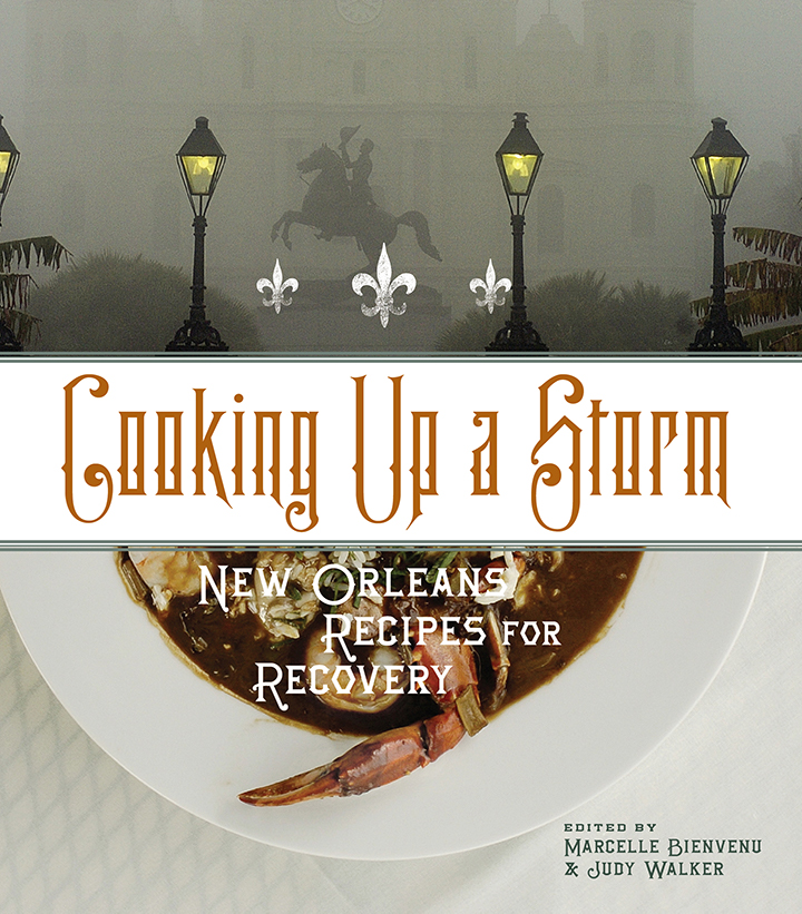
COOKING UP A STORM
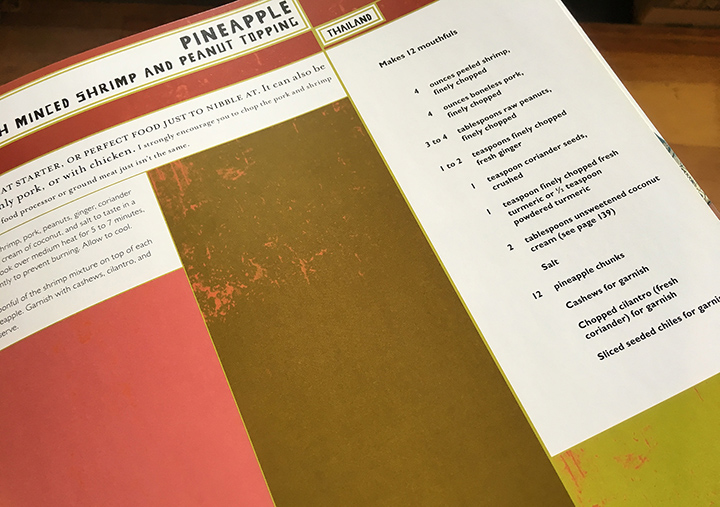
It’s always fun to combine our loves of culture and travel and books, and this was another opportunity, to highlight our neighbors to the east. Cooking up a storm is what we love to do, and it is always about using the right ingredients, in the right amounts, to create an absolutely authentic flavor, mon cher.
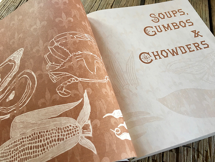
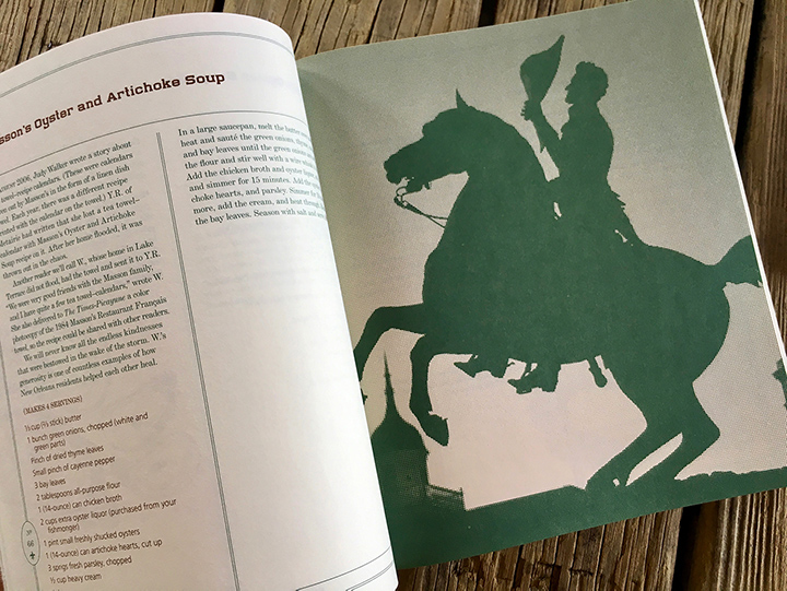
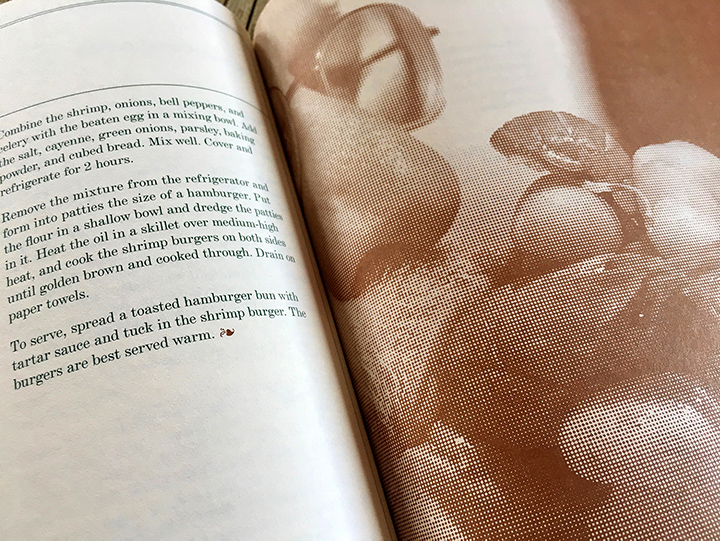
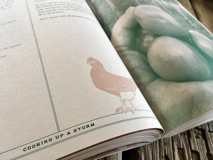
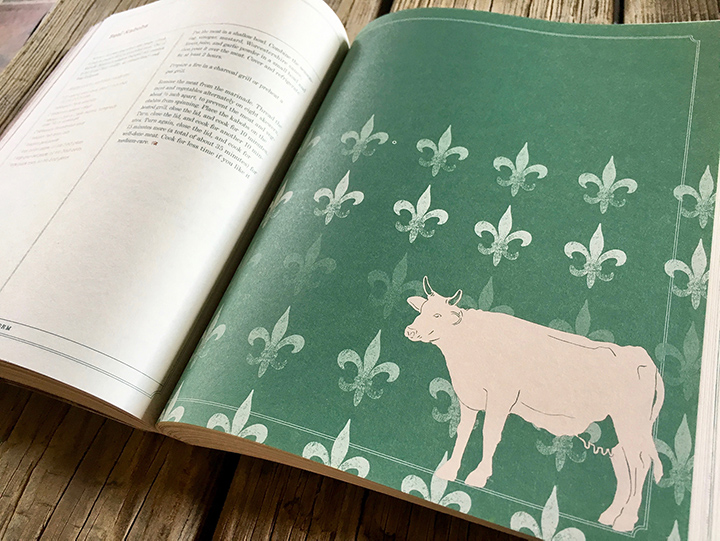
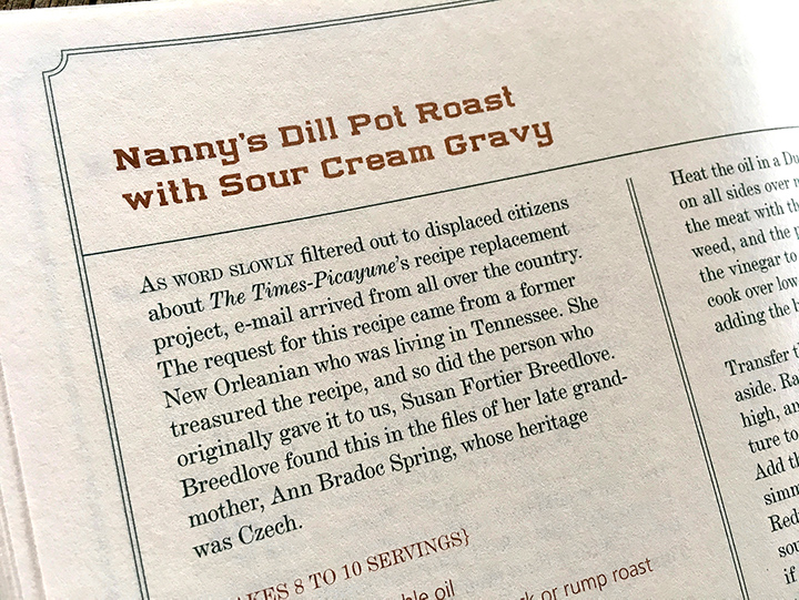
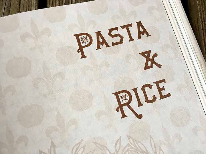
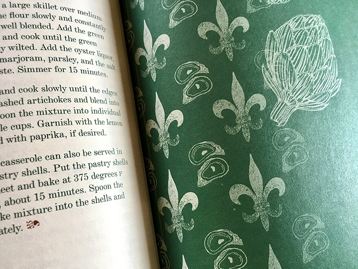
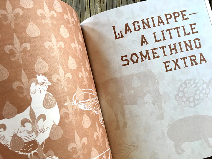
These recipes are family favorites from the New Orleans area, compiled by the New Orleans Times-Picayune. Budget was limited, but we brought in one of Louisiana’s treasures, illustrator Francis X Pavy of Lafayette, to add our version of lagniappe, with his funky and chunky and down-home woodcarvings.
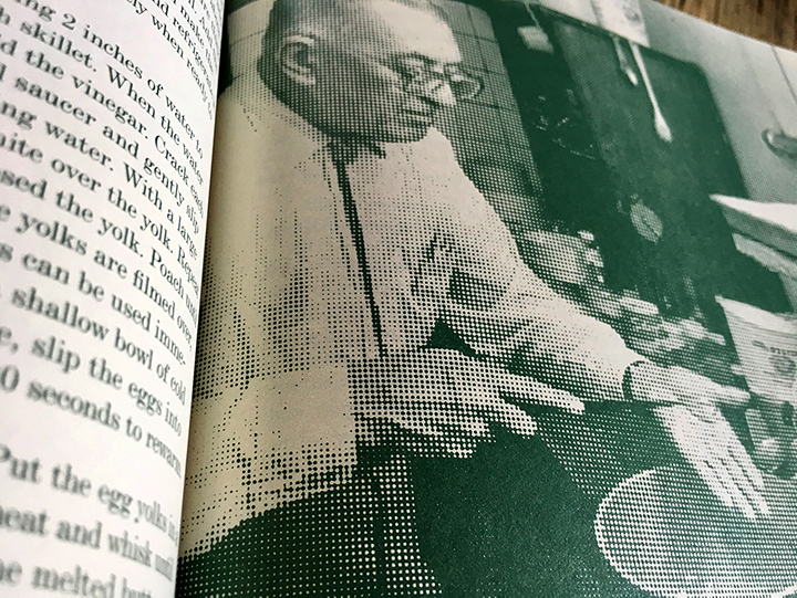
If when looking at the small spreads, you ask yourself why our Poultry section does not have Pavy’s chicken big and bold, we’ve included a scale version of our fleur-de-lis wallpaper that incorporates said chicken — and okra, and everything else in this kitchen - celebrating both illustration and food. And if wondering why the photos look a wee bit blurry, well that’s because the final images are extra-large-dot duotones, which helps balance out a collection of photos from disparate sources, a simple trick to make the book cohesive.
One of the great things we love about projects that involve such flavorful cultures is learning more about typography and then finding the exact letterforms evocative of time and place. Here we’ve paid a respectful nod to New Orleans’ rich and eclectic past, as well as added a few modern flourishes just to keep things nice and neat. All that said, somewhere in the back of our collective heads, we were wondering about the best of low-budget, two-color cookbooks from the 1950s-1970s, albeit with more refined typographic direction.
“I was very impressed by your work on Where Flavor Was Born. Having worked so hard researching and writing the book, I am always very nervous when, suddenly, the baby is in someone else’s hands. What will happen? Will the designers see my project? How will they raise and nurture my baby on its way to adulthood and a place of its own in public? I found that you really saw the material and managed to create a palette for the palate, to communicate my stories and those of my photographer, and to present the book with a personality that was at the same time friendly, accessible, confident and unique. Chapeau! [hat’s off!]”