Marc English : Design
04 THE CRITERION COLLECTION
PACKAGING : PUBLICATION : INTERACTIVE MENUS
I’m coming out of the men’s room at a club in Austin. French actor and chanteuse Julie Delpy has been singing, having just premiered her latest film by and with Austin’s own writer/director Richard Linklater, Before Sunset.
A guy runs up to me and says “HEY! Some people are looking for you! They want you to design the DVD packaging for a new release of Slacker!”
If you live in Austin, there is really no excuse for not having seen Slacker, the seminal film by Rick — er, RICHARD — Linklater. It not only defines a place, but a time. And not only that, but it holds one of the champion positions in the annals of Independent Filmmaking.
So of course I was thrilled to meet the kind folks with The Criterion Collection. Criterion holds a unique place in both culture and commerce.
Why me? Met Rick thru Harvard prof and filmmaker Robb Moss, with whom I’d played softball at MIT. Then ended up doing all the branding for the Austin Film Society, which Rick started, back in ‘85. So of course Rick knew my work, especially as I’d done a piece for the 10th anniversary of Slacker. He trusts me. I cannot say enough about those who trust me. Because it’s never about me, but about me taking the time to understand them, to listen to them, and they know I’ll do that.
Below, a few words on some of the projects we’ve done for The Criterion Collection ...
SLACKER
“It’s been 14 years in the making, but the film that planted Austin on the topography of the national consciousness has finally arrived on DVD in an appropriately, gloriously bells ‘n’ whistles package from the Criterion Collection, in an equally gorgeous package courtesy of local design guru Marc English of Marc English Design.” Marc Savlov : The Austin Chronicle
Richard Linklater’s first major film defined a term, a generation, and left an indelible mark on a city now known as a film town. For us, an opportunity to dig into what we know best: Let it be what it wants to be.
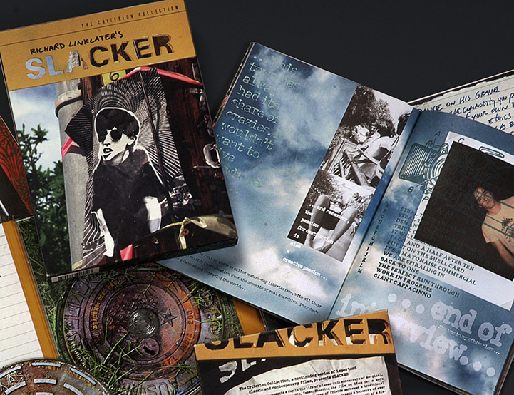
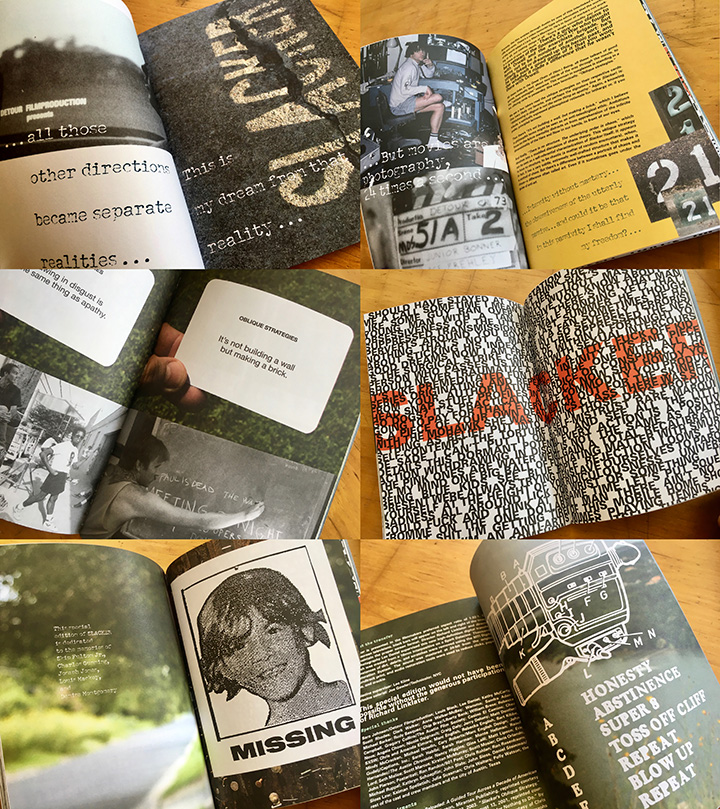
Linklater’s films are known for their writing, their words, how people interact. While the film is in continuous motion, it is the dialogue that drives it. It was a no-brainer to litter the book with lines from the film, sometimes randomly, sometimes in conjunction with specific art. One could argue that you could step into the film at any point, as there is no plot. Same goes for the book - the pages are part of a whole, but each lives on its own.
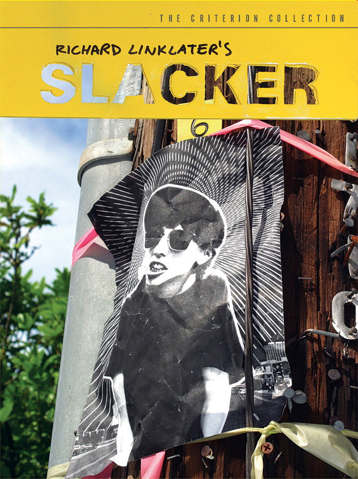
From the first it made sense to use the original logo and the best-known character (Madonna pap-smear woman, as she’s called), who had been used in the original promo. Personally, I couldn’t stand the image - there were other characters I preferred. But its not my film, and again, you have to be aware of the audience. So we got subversive - which only made sense, as there are a few times in the film where the characters - the slackers - are talking about bucking the system. So we joined in.
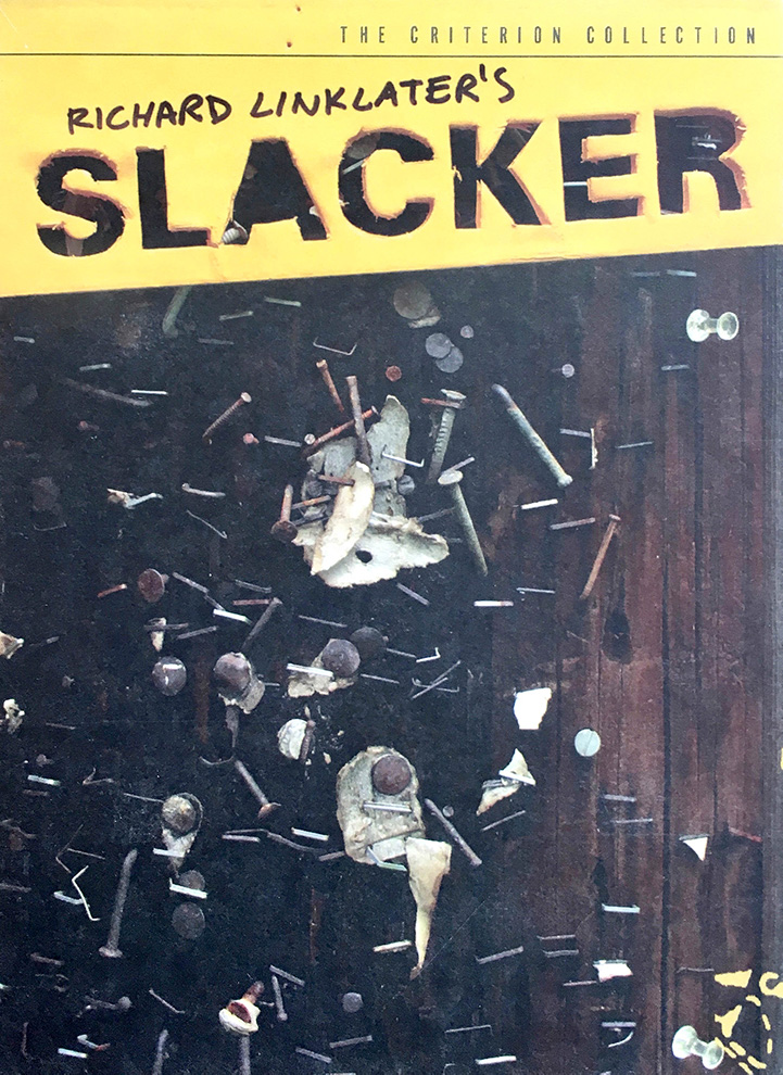
For the most part, every time we needed the logotype, it was based on a rude foam-core stencil. We printed out the original, taped it to foam-core and just cut straight thru, with a dull blade. Why change it? Be a slacker. Then we spray painted the foam-core yellow, (when the film was released on video, back in the 90s, a companion b&w book was published. Both book and vid packaging used yellow, so we picked up on that) and holding it against a variety of exterior surfaces used it as our title-card. And we used the shadows it created in camera (Nikon D320 digital), the leftover forms we’d cut out, and even spray-painted the stencil behind our office so as to have it on concrete.
And when it came to using pap-smear gal, we stapled a laser print of her to a telephone pole, after having soaked it in water, and then drying it -instant weathering. With that image and our hand-held template, we had a cover. Of course using pap-smear gal came after a suggestion from Criterion after they’d seen - and loved - one of our original ideas: the title-card against a close-up of a staple ridden telephone pole. We’d presented other versions of the card, with the card reflected in puddles, held up against the sky that the natural ambiance of sunny Austin literally came thru the stencil. We knocked out a few dozen variations, before locking on the inclusion of pap-smear gal. When working on projects that have several components, we can’t stand each piece being identical, so we had the opportunity to use some of our early ideas. The cover of the digipac which houses the disks is just the close-up of the pole, with the title-card; the shadow created by the stencil shows up in the book as the title page.
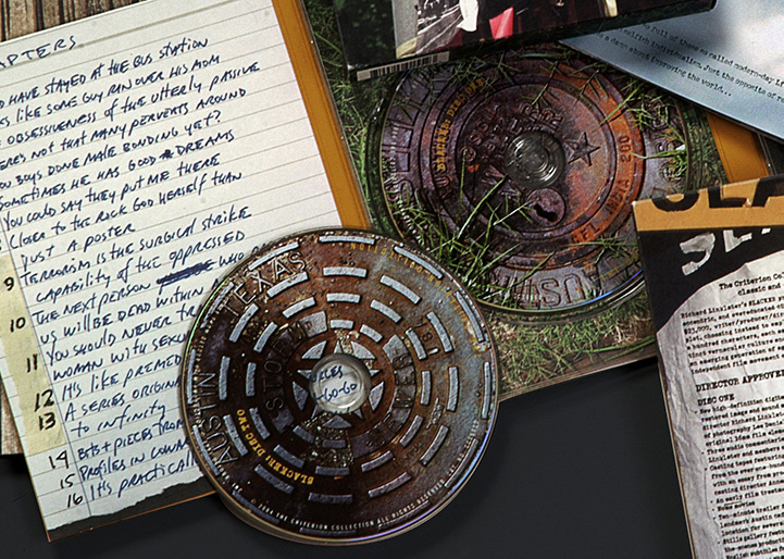
We roamed the streets near our office photographing numbers that we found on telephone poles, utility boxes, stenciled on curbs, which we used for pagination. Used the manhole covers for the actual disks. Bingo. Perfect. It doesn’t get more Austin, or street, than the manhole covers 25’ from our studio. We faked the spray-painted logo on them as I couldn’t bring myself to mess up the neighborhood. South Austin is a whole ‘nother world. We’ve helped bring that Austin experience to life.
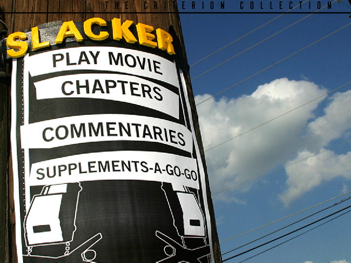
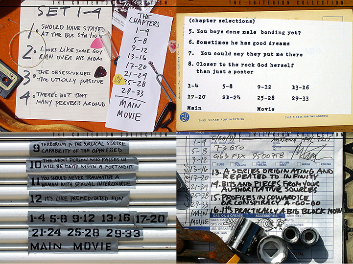
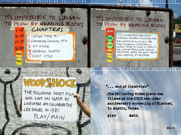
The opening menus are slacker in every sense of the word: nothing happens. Except that one can hear the sounds of traffic, birds, watch clouds slowly move or see tree leaves rustle, as we pointed cameras at our menus and left them there. No images from the film, but instead becoming part of the film, unlike every other menu out there (including others we have done).
Criterion, much to their credit, saw the value in that approach, even though it meant more work for them, locking in their editorial content. And it certainly meant more work for us, but it just seemed like the right thing to do. It meant designing individual menus - that would align properly on-screen, so as to have the proper vertical or horizontal attributes necessary for the internal programming - and after having designed them, constructing them with appropriate materials, setting up the photography on location, and finally popping them into our formats. We over-delivered, in terms of what Criterion expected, but the alternative would have been business as usual.
That’s how we approached it: total immersion. One of the aspects that made the project so enjoyable was the D.I.Y. approach. It’s punk. It’s street. But like the film, not without some planning. Shooting on 95 degree days created REAL sweat. Those are REAL flyers for the opening menus on each disc. REAL clouds moving overhead, REAL street sounds. They’re not in the film, but they are OF the film, and that was our approach all along. Not to mimic, but to add our slant to existing material. When we’re at our best we’re creating something in the moment, that stands the test of time, something appropriate and beautiful - even if that beauty is in the mundane.
We created new art, approaching it as if we were on set, and had to create complimentary materials for print and menu-screen. The menu screen which is a band flyer outside a club, was created and photographed outside that club. The messy plate after a lunch of Tex-Mex food, was my messy plate after a lunch of Tex-Mex food, with my notebook on top of it. There are several dining/drinking scenes in the film. I imagined one of the characters looking down and seeing that plate. Not a thing fake about it. And I usually eat that meal at least once every three weeks.
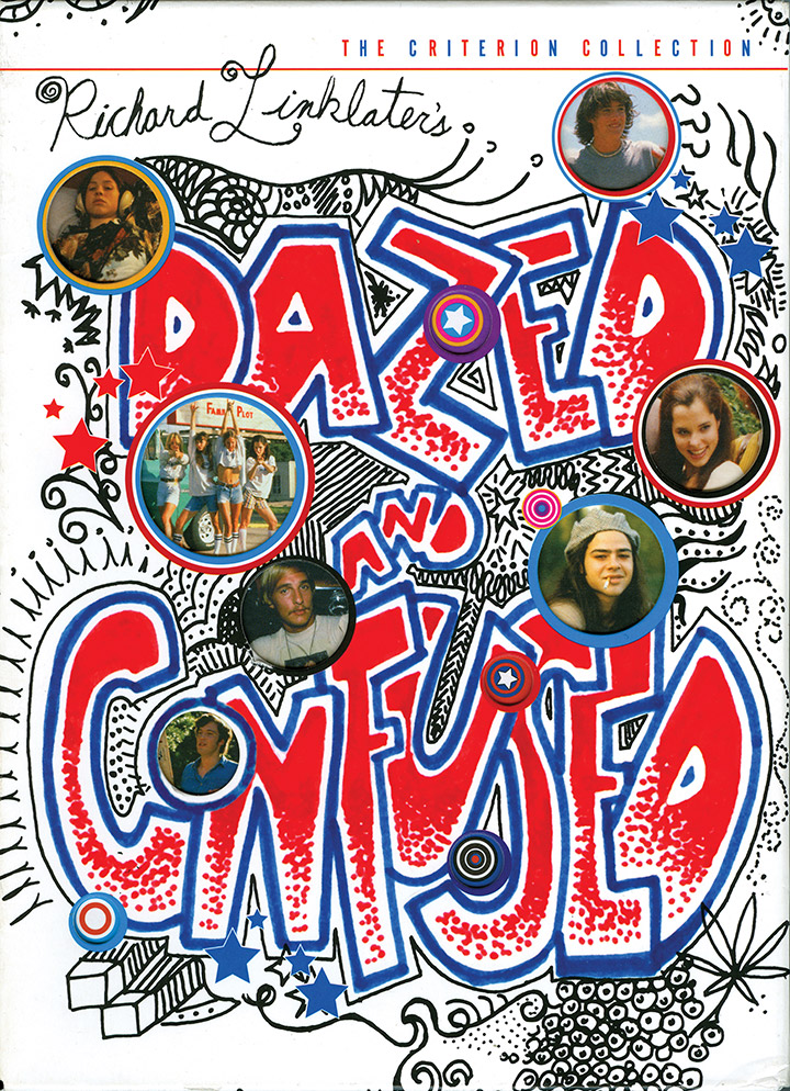
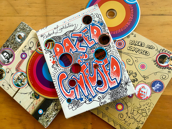
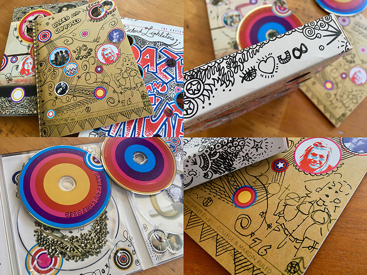
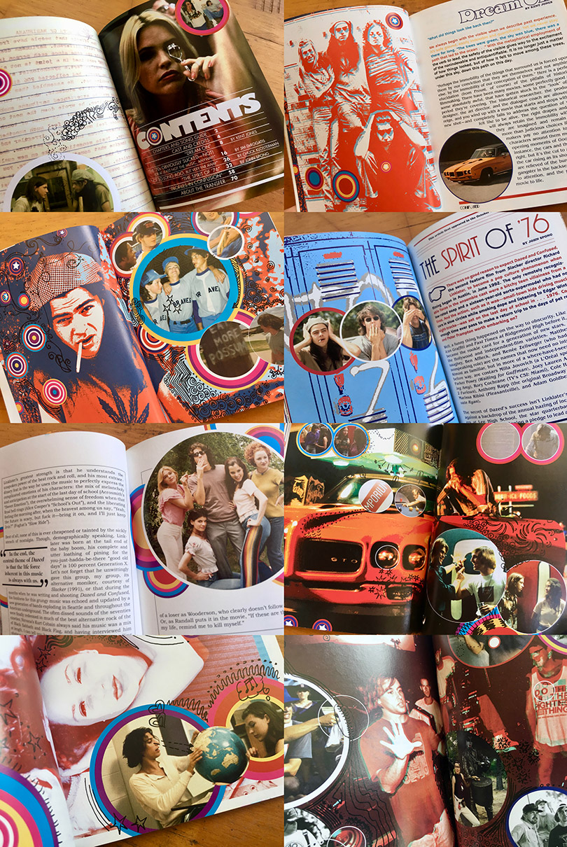
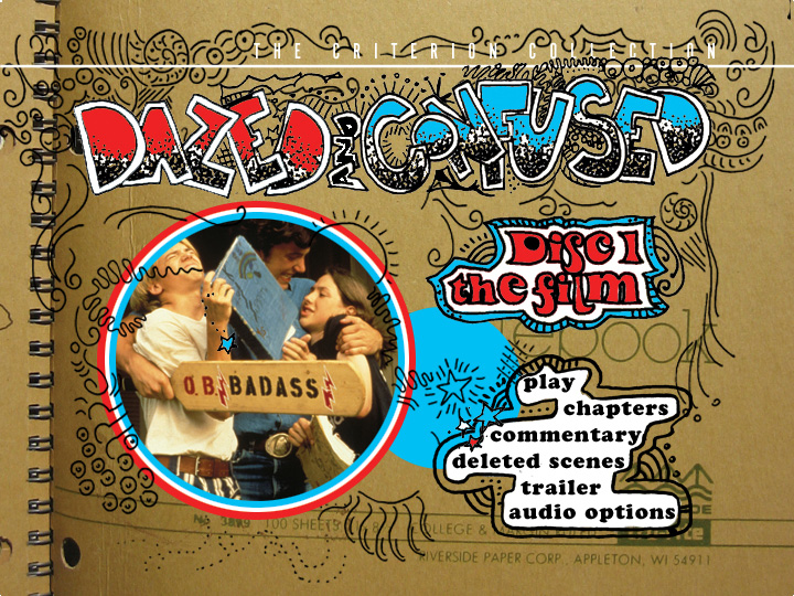
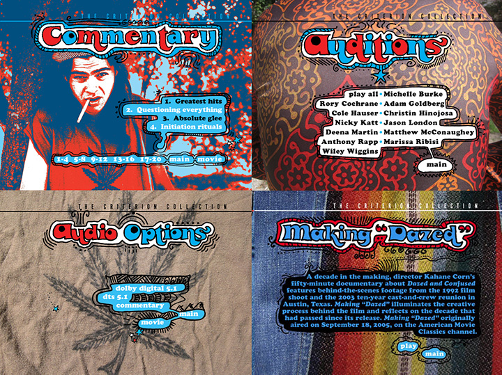
DAZED & CONFUSED
76 RULES!
“It’s an incredible multimedia experience, turning the added content into a kind of celebration of the mind. Add in the clever packaging (reminiscent of the pop art note- books of the era) and a 72 page insert (fashioned after a yearbook) that covers the movie’s production, you have got one of the most complete packages this digital stan- dard bearer [Criterion] has ever created. It is truly exceptional in all aspects - technical and contextual.” Bill Gibron : DVD Talk
“Dazed and Confused is a joyful slice of youthful life that almost plays out like one of your own memories. It’s fresh and funny, and a trip I don’t mind taking again and again. Criterion has done film fans a great service: they knocked one out of the park with this DVD . . . Rounding out is another terrific Criterion booklet, filled with pics, essays and more. And the cover art is pretty sweet, too.” Michael Jacobson :DVD Movie Central
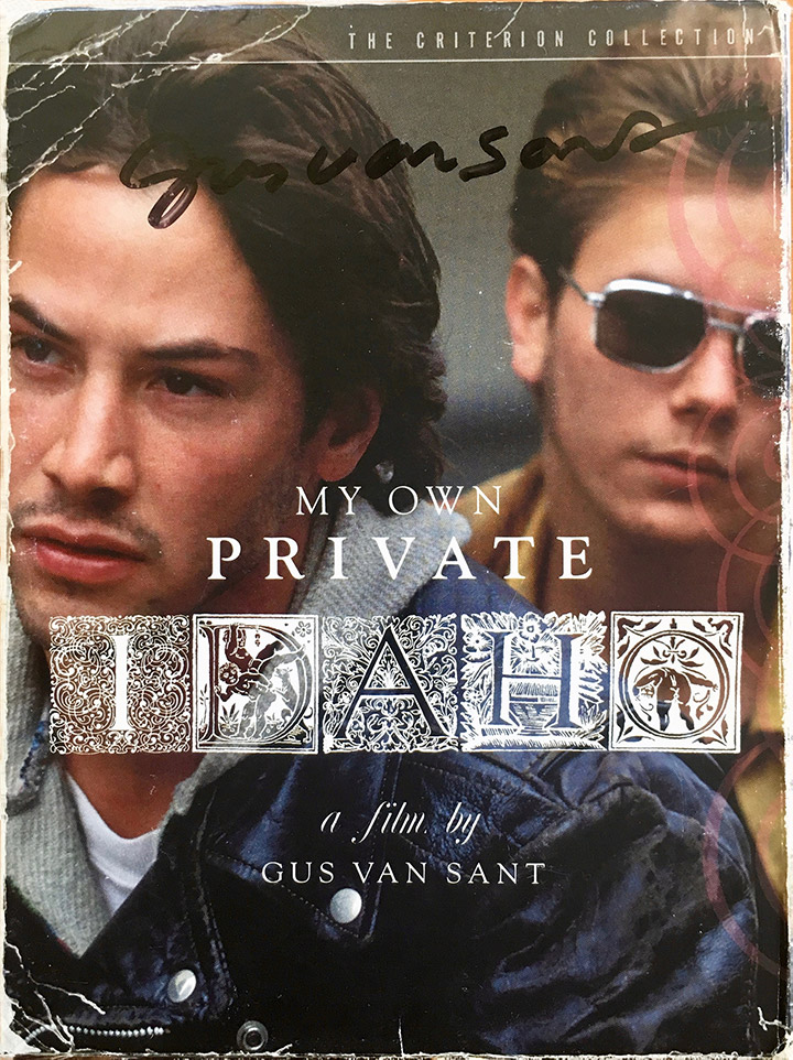
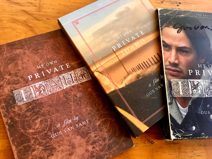
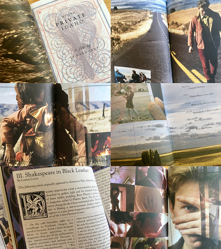
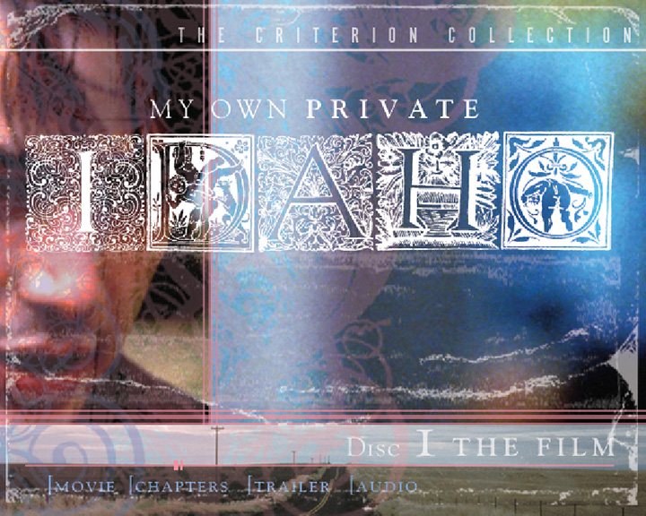
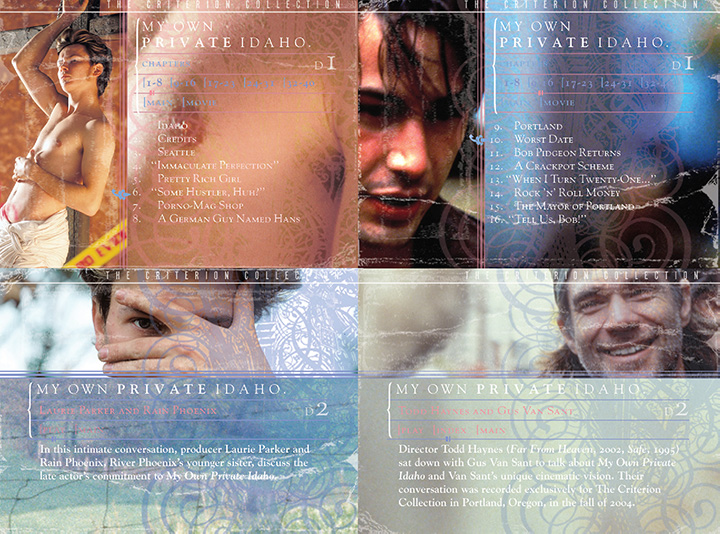
MY OWN PRIVATE IDAHO
“. . . Insanely beautiful . . .” Sarah Habibi, Art Director : The Criterion Collection
“. . . rich, dreamlike imagery . . .” Nancy Bernard : Step Inside Design
“A longtime ‘Idaho fan’ (although not a ‘fanatic’) and that’s how I came across the packaging. It is one of the most beautiful designs I have seen, and also perfectly conveys the many essences of the movie — in fact, in some ways I like it better than the movie itself! (is it heretical to say that?) I only wish my other favorite movies received such lavish packaging treatments. I live in Seattle, one of the 3 locations featured in the movie.” Kestral Windhover : Seattle
“Criterion is known for the beautiful, artistic cover art it wraps its releases in, all of which stand out from the pack of “big head” photo packaging. With My Own Pri- vate Idaho, they went above and beyond, starting with the matte-finish cardboard slip- case, which sports a weathered book design that fits the pseudo-adaptation perfectly. The attention to detail is amazing, as the art even wraps inside the case, whereas most packaging would stop just inside the lip.
Slide the goods out and the set continues to impress. A beautifully designed four-panel digipak that carries over the movie’s feel while conveying necessary information about the DVDs, is accompanied a gorgeous softcover booklet full of interviews that was produced with the artistic vision seen in expensive coffee-table books. Elegant art, DVD instructions and chapter stops - classy packaging, excellent book, - MOPI is one of the most film-appropriate DVD sets ever produced about a single film. Too often, packaging serves to camouflage an inferior product, but here, it supports and enhances a fantastic film. Francis Rizzo III : DVD Talk
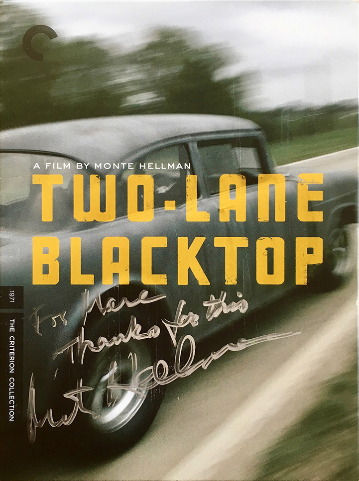
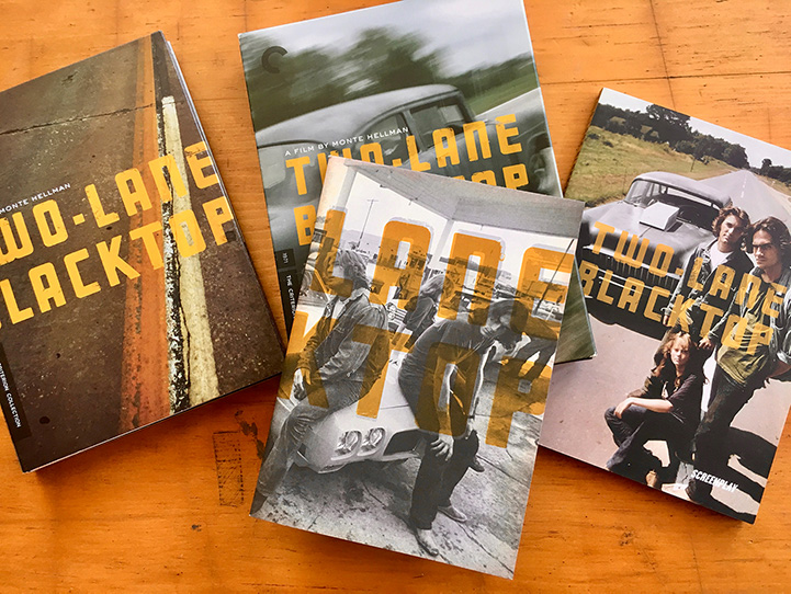
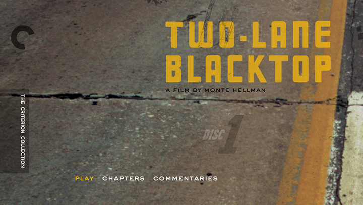
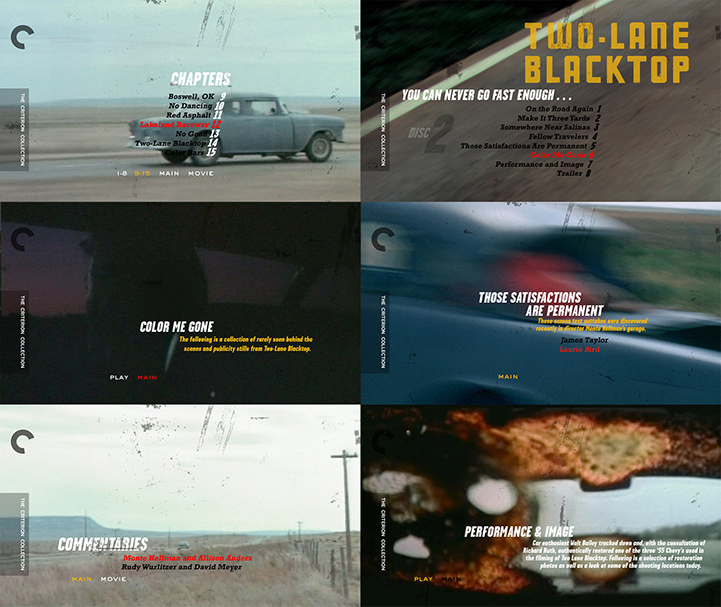
TWO-LANE BLACKTOP
“Classy, sophisticated, elegant, gorgeous” Monte Hellman : director Hey, if Monte digs it, then we’re happy.
“Criterion’s version may be the most attractive package they’ve ever put out. It’s the shit. I would be in awe of it even if it held a movie I didn’t like. It’s got a beautiful design.”
Hi Marc,
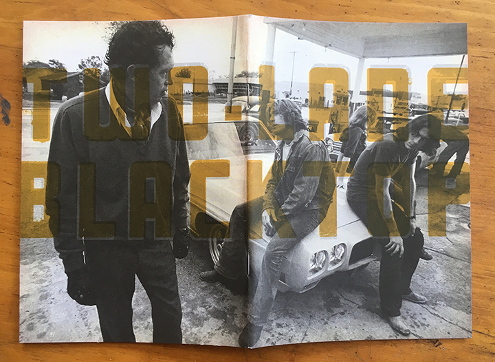
I’d like to echo the above sentiments from a blogger. I couldn’t be more pleased with the way the package turned out. Every thing about it is a delight to the eye. You managed to use BOTH my favorite cover designs, one on the box, the other on the disc holder fold-out. And I love the split photo of the gas station as you open the fold-out. And everything is so clean and simple. Anyway, thanks very much for your integral contribution to the success of the DVD.
All the best, Monte Hellman
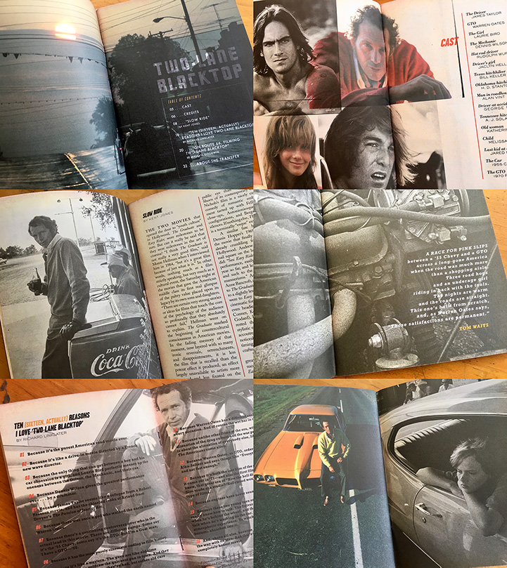
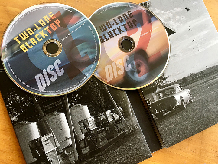
“The Criterion Collection Two-Lane Blacktop two-disc set is an absolutely beautiful thing to buy, hold, unwrap and feel cool about owning. It’s got the two DVDs with the remastered feature on one disc and several “looking back” video shorts by director Monte Hellman, plus Rudy Wurlitzer’s original script and an essay booklet. It’s a first-class package all the way.”
“Alone amidst all of Criterion’s top-shelf rediscoveries, 1971’s Blacktop is the legendary, fuel-injected car ride to nowhere. It may be the single-most American road film ever made, part Bresson silence, with just the gravel thrum and sidewall whisper of the post-Graffiti, pre-Apocalypse U.S. of A. radiating off of it like something out of Kerouac’s dark, endgame dreamings, and part Route 66(6) downward spiral, a pitch-perfect portrait of the mid-’Nam quest and failure never for high-octane meaning and poetry of motion in the midst of torque-ified terror. It’s an anxious, nervy ride, now, finally, complete with a Dolby 5.1, sternum-rattling sound mix that seems to find its proverbial vanishing point. Like the sunbaked Santa Fe macadam and shoulderless hellway that, in time, came to be the new American reality - strip malls and strip bars and little else to gauge your bearings by - Two-Lane Blacktop for once and for all looks and feels like the Great American Epic it always was, right down to Marc English’s spare, dreamy design.
The packing is English’s coup de grace, a perfectionist, minimalist design job that tweaks the borderline existentialism of the film right into the packaging. But don’t take our word for it: Hellman was so impressed by the Criterion/English treatment his film received that he promptly went out and bought a massive, 50-inch television to screen it on.
“As of last week, it’s gone into a fifth pressing,” says Hellman, by phone from L.A., noting that not only is that unusual for a cult film whose only previous DVD release (from Anchor Bay) is long out of print but much of that is due in no small part to English’s design, which smartly mimics the spare, clean lines of Hellman’s rocketing road-to-nowhere odyssey.
“His work just exemplifies Criterion’s style in that it catches your eye immediately,” enthuses Hellman. “It’s so different from any other company’s DVD product that it’s like it’s from a totally other world. From a director’s standpoint, I don’t think that anyone imagines that a film they make is going to be alive and well after almost 40 years, and certainly when it was made, nobody envisioned that anybody would be looking at it with fresh eyes almost 40 years later. When we were doing the color correction on it, I realized, wow, this is a whole ‘nother world. I’m just really overwhelmed by Marc’s work on the design. I think it’s one of the most gorgeous packaging jobs I’ve ever seen. I just like everything about it.” Marc Savlov : Austin Chronicle
Experiential design draws on experience. Genuine experience. Not store-bought, pre-fad- ed, faux weathered. The real stuff. You know it when you see it. Hellman’s film is that, the real stuff, not a false note. Warren Oates as GTO. James Taylor as The Driver. Dennis Wilson as The Mechanic. Laurie Bird as The Hitchhiker. A ‘56 Chevy and ‘70 Goat make their way across the USA, for purposes best left to the filmmaker, but carving out that last piece of American Pie, as this 1970 film serves as the Last Film of the 1960s.
Fortunately, we could relate to this American Existentialist road movie, having covered our share of backroads, dirt roads, and every kind of road in the U.S. Heck, we’ve even covered many of the same roads in the film, riding hot and heavy, day and night watching shadows grow and fade, across California, Arizona, New Mexico and through the small towns of Oklahoma and those east of the Mississippi. Which means not only have we lived the film to a degree, but can readily draw from the small-town typography and lettering in places where the words “typography and lettering” are met with a stare. So when it comes to source material, we’ve been in the thick of it and have the “liberated” signage and motel artifacts to prove it. As well as a license plate or two, liberated much as in the film.
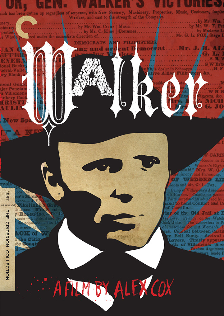
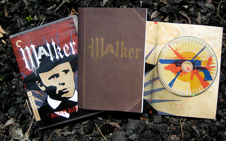
WALKER
“Regardless of what you may think of that film’s surreal, Peckinpah-meets-Gilliam take on the Walker mythos, one thing is already inarguable: From a design standpoint, Criterion’s Walker will suck your eyes right out of your head and its retail price right out of your pocket. It’s worth it, every penny. And for that, you can thank/blame Austin-based graphic designer Marc English of Marc English Design.
To be sure, fans of Cox, Harris, and a post-Clash Strummer have just cause for imminent revelry, but what’s really - and instantly - remarkable here is English’s cunning, audacious graphic design. Composed of a pop-arty pic of Harris portraiture atop a field of dusky crimson, with archival, period text visible beneath and jagged blue, kinet- ic outbursts radiating from behind, Criterion’s Walker should be filed under “O” for “ordnance.” It looks less like a DVD package and more like a dark promise of revolu- tion, a lesson in chaos, and, above all, a real-life, based-on-a-true-story story. It’s English’s version of the Clash’s Sandinista! pared down to its rebellious visual quick: Viva Nicaragua! Viva la Revolucion!” Marc Savlov : Austin Chronicle, 14 Feb 2008
A hallucinatory biopic that breaks all cinematic conventions, Walker, from British director Alex Cox (Repo Man, Sid & Nancy), tells the story of nineteenth-century American adventurer William Walker (Ed Harris), who abandoned a series of careers in law, politics, journalism, and medicine to become a soldier of fortune, and for several years dictator of Nicaragua. Made with mad abandon and political acuity - and the support of the Sandinista army and government during the Contra war - the film uses this true tale as a satirical attack on American ultrapatriotism and a freewheeling condemnation of “manifest destiny.” Featuring a powerful score by Joe Strummer and a performance of in- tense, repressed rage by Harris, Walker remains one of Cox’s most daring works.
For this project we merged two distinct genres: mid-19th Century, antebellum archival publication design (lifted directly from the Walker files in Tennessee) and a healthy dose of mid-1980s Sandanista agitprop, doing in design what Cox has achieved in film. Criterion’s head honcho says this job is “a design festival” and their art director concurs with “I seriously love it. You guys kicked some ass on this one.”
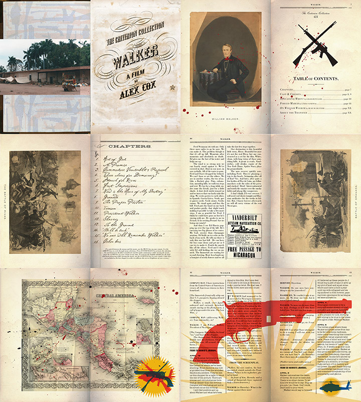
“Wow. Let me just say, they do amazing work. I LOVE THEM. It takes a lot to get me excited after 10 years here, but Marc totally ‘gets it’. The best DVD packaging considers the entire concept of the production. Marc English Design is a perfect choice because they understand that presenting the world of each film is essential. The care and consideration with which each and every element is designed, makes it very clear how much they understand each movie. And we love their design as much as we love the films. Their design is the kind of presentation that involves the viewer and fan of the film; there are many tidbits to discover and make connections to. Just perfect. Marc English Design rocks savage.”