Marc English : Design
10 WHOLE FOODS MARKET
PACKAGING
The phone rings. It’s Patty Fair, Team Leader, Creative Services, Whole Foods Market asking us to work on packaging for their private line of products. We’ve not spoken in fourteen years. Back then, upon moving to Austin and hoping for a soft landing, I served a brief stint as CD for a studio that not long after, went belly-up. Whole Foods Market was their main client. WFM only had a few locations at the time, and I came on board while they were in the middle of their first year of having a monthly newsletter. The studio was about to lose WFM as a client, due to a conflict between the principal and Patty. I salvaged the relationship, but that didn’t save the studio from folding. The salvaging is a good story, but we’ll have to sit down and chat about that one. Regardless, Patty recalled my efforts, with design, project management, and the all-important aspects of interpersonal interactions.
Now it’s fourteen years later, and Patty and WFM have just dismissed the London-based branding firm Turner Duckworth, who’ve been retained for six months. TD are international in scope (London/NYC/San Francisco), have handled all the big brands. I’ve got a small studio in South Austin with a few interns, and a couple of junior designers, at best. I ask Patty to send me any of the TD findings, and her reply is short “You know who we are, who our customers are.” Her only concern is “What if I don’t like what you come up with?” Her reaction later? “I can’t believe you read my mind!”
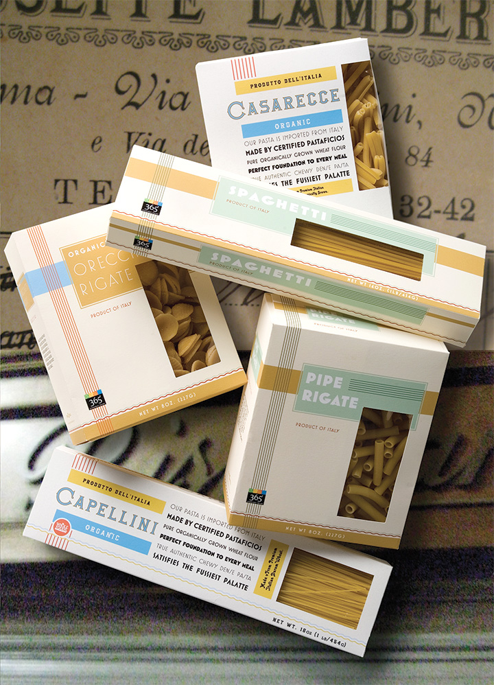
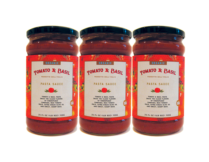
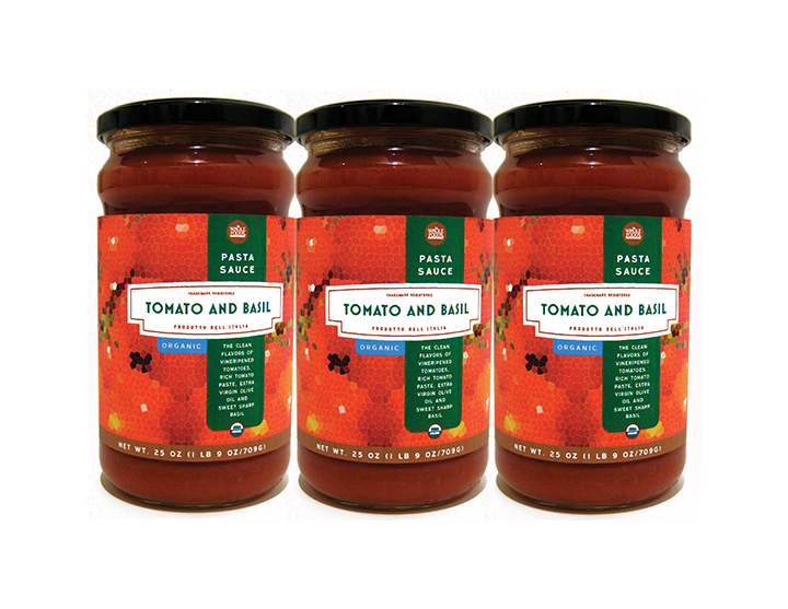
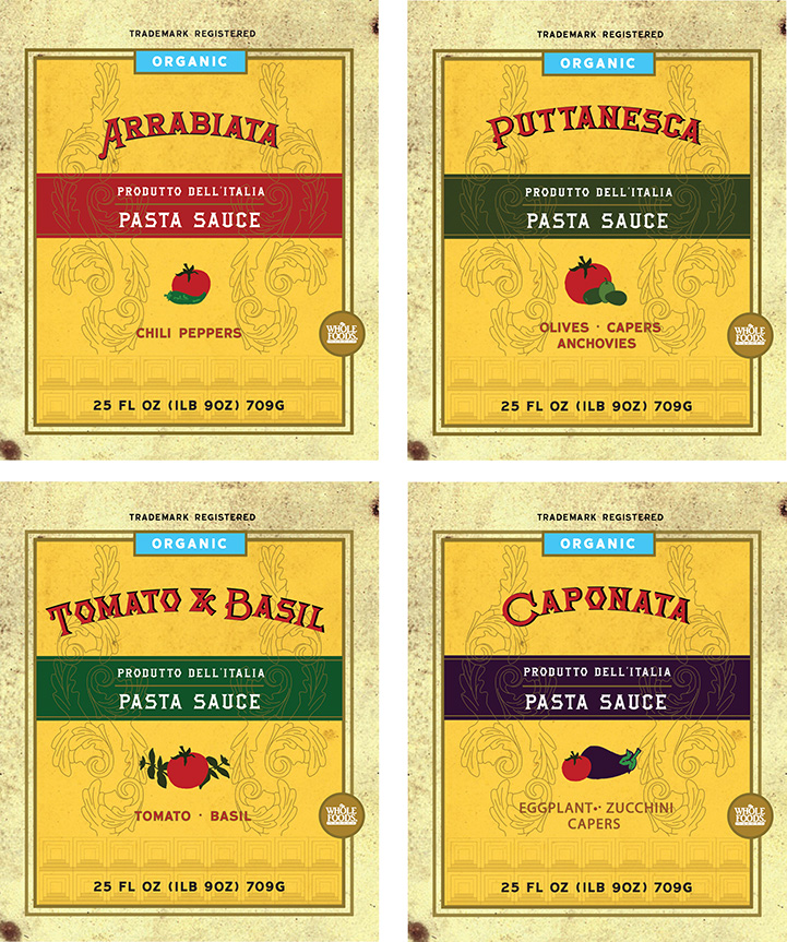
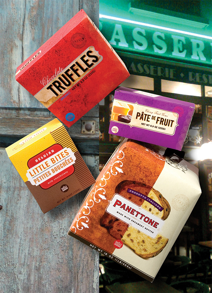
Our idea, that all products should not be branded by a monolithic standard. Instead, each product has the integrity of the actual content and point of origin, if appropriate, essentially creating visual experiences that bear repeated viewings.
Remember when you were a kid and read all the words on the cereal package while you sat at breakfast? Our task: make the packaging engaging, so one will take the product off the shelf in the store, and be pleased with having it on the shelf or table in the kitchen.
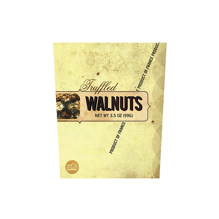
Our research goes into finding typefaces, colors and textures that are appropriate to a given product and country of origin, to create an authentic experience.
Our approach to identity and packaging stems from the relationships and identities of families. Mothers, fathers, brothers, sisters, cousins, grandparents, may have similarities but they are not identical. The same should happen on the shelf - they should fit together, but not be clones.
It helps that the “grandparents” here — the more refined WFM brand, versus the everyday 365 brand — are reflective of their pedigree: old school typography that any Italian from 100 years ago would recognize. While the 365 identity may follow the lines of between-the-wars Italian art deco, they still carry rules and wavy lines that can be found in the “older” line.
It also helps having spent some time winding two-lane roads from the Italian Alps to the Italian coast, through such historic and contemporarily vibrant cites like Firenze, Siena, and Rome, not to mention the many small towns in between. This allows for an understanding of local flavor, whether it be food or design. Either way, it all adds up to an appetizing combination. Molto bene!
As seen by the background images, it helps to be able to do research first-hand: a road trip from Milan to Nice, up through Provence, up into the Alps, allowing for the requisite photos that many designers take, shooting vernacular signage, landscapes, architecture, and understanding authentic color palettes. It’s one thing to open up a reference book, it is quite another to open a door to a local sweet shop and do the best kind of research.
Whether working on packaging for a Caponata pasta sauce, or for every-day aluminum foil, the overall objective is an end-result that is both appropriate and unique.


“I knew that Marc would inspire, delight and push the edges of our package design.
He delivered with passion. His packaging designs are authentic and evocative, reflecting the origin and tradition of our favorite food artisans. The designs not only successfully stand out on a cluttered grocery aisle (a challenge in itself these days) but also live beautifully in the pantry of Whole Foods Market customers.”